Typography Terminology: From Apex To Swash And The Gadzook In Between… Everything You Need To Know About Fonts | Martech Zone
My main hobby growing up, when I wasn’t getting into trouble, was drawing. I even took a couple of years of drafting courses while in High School and loved it. It may explain why I often post articles on graphics, Illustrator, illustrations, and other design topics. Today, it’s typography and the design of fonts.
Typography and the Letterpress
If you want to take a step back in the history of fonts and typography, this is a great little film on the lost art of the Letterpress.
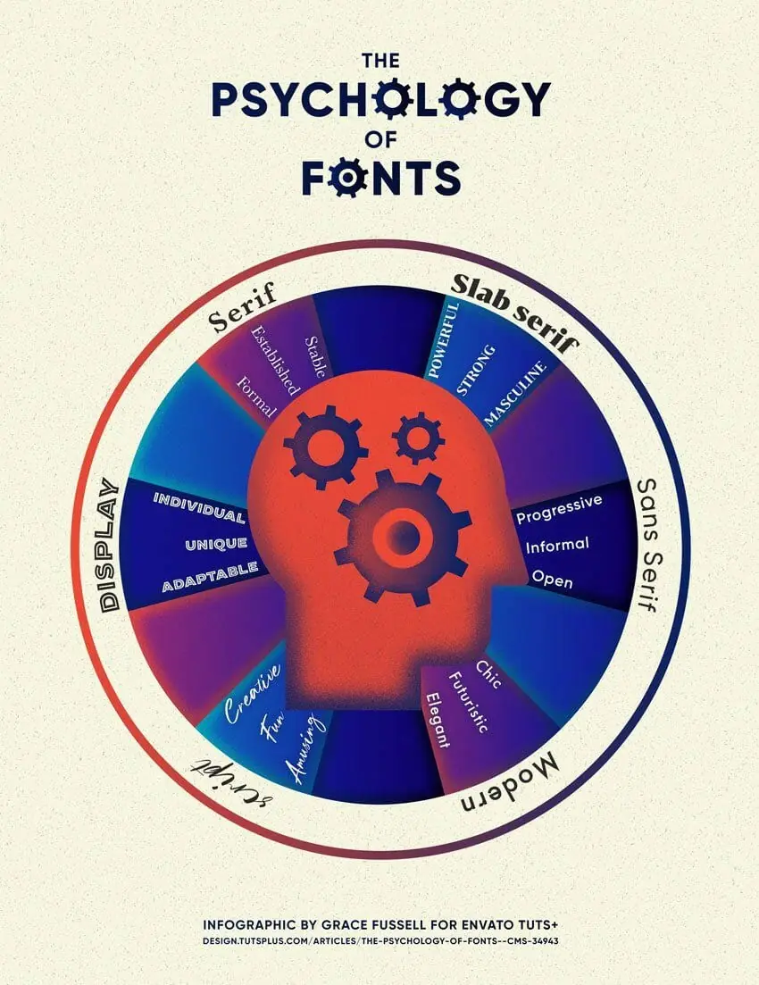
The Psychology of Fonts
After decades of working in both print and online, I believe I have a good eye for great design. Fonts play an incredible role in presenting a brand, evoking emotional responses. In fact…
Not only is the appearance of text an important consideration for brands, but the appearance of different fonts can also have psychological effects on the viewer. By changing the style of font, choosing a more emotional font or a powerful font, a designer can make the viewer feel and respond differently towards a brand.

Do you still doubt the power of fonts? There’s even an exceptional video that provides the history of type fonts and war. And, of course, be sure to check out the movie Helvetica (on iTunes and Amazon).
Font Types and Typographic Design
Typographers accomplish incredible detail and workmanship in designing fonts. Here’s a cool little video on typography. Many people don’t know all the work that goes into font design or how important fonts are to messaging.
It’s a great video for explaining a font’s properties, but I wouldn’t say I like the fonts they use in the video. I wanted to share it with you anyway! That way, when you want to explain to your designer that you want more space between letters, you can speak their language and say, Can we try increasing the kerning?
Typography is fascinating to me. The talent of designers to develop unique fonts and express an emotion is nothing short of incredible. But what makes up a letter? Diane Kelly Nuguid put together this infographic to provide insight into different parts of a letter in typography:

Typography Terminology Glossary
But there’s much, much more to the art of typography. Here’s every aspect and characteristic that are designed into a font by Typographers.
- Aperture – The opening or partially enclosed negative space created by an open counter.
- Apex – The uppermost connecting point of a letterform where two strokes meet; may be rounded, sharp/pointed, flat/blunt, etc.
- Arc of Stem – A curved stroke that is continuous with a stem.
- Ascender – A portion of the font that ascends beyond the height of a character.
- Arm – A horizontal stroke that does not connect to a stem on one or both ends.
- Bar – The horizontal stroke in characters A, H, R, e, and f.
- Baseline – The horizontal alignment of the base of the letters.
- Bowl – A curved stroke that creates a counter.
- Counter – The partially or wholly enclosed space within a character.
- Cross Stroke – A line that extends across/through the stem of a letter.
- Descender – The part of a character that sometimes descends below the baseline, typically in a g, j, p, q, y, and sometimes j.
- Ear – The stroke projecting from the top of a lowercase g.
- Foot – The part of the stem that rests on the baseline.
- Gadzook – The embellishment that connects the two letters in a Ligature.
- Joint – The point where a stroke connects to a stem.
- Kerning – The distance between letters in a word.
- Leading – The distance between the baseline of one line of text to the next.
- Leg – A short, descending stroke on a letterform.
- Ligature – Two or more letters connected to form one character; primarily decorative.
- Line length – How many characters fit in a line before you return to the next line.
- Loop – The lower portion of the lowercase g.
- Serif – The projections extending off the main strokes of a character. Sans serif means without Serif in French. Serif-based fonts have been known to help people read faster since the shape of the word is better defined.
- Shoulder – The curved stroke of the h, m, and n.
- Swash – A decorative extension or stroke on a letterform.
- Stem – The main straight, vertical stroke in a letter (or diagonal when there are no verticals).
- Stroke – A straight or curved line that makes up the bars, arms, stems, and bowls.
- Terminal – The end of any stroke that doesn’t include a serif; includes ball terminals (circular shape) and finials (curved or tapered in shape).
- Vertex – The point at the bottom of a character where two strokes meet.
- x-height – The height of a typical character (excluding any ascender or descenders)
Janie Kliever provided the second infographic for Canva with some additional detail. Click on it to visit their article for an in-depth view of each.

Font Resources
Want to explore some font resources online? Here are some great resources:
- Adobe Fonts
- Fontspring
- InkyDeals Font Bundles
- Google Fonts